Showing posts with label User Experience & UI Design patterns & PET & HCI. Show all posts

Skeuomorphic vs Flat vs Flat 2.0 (season 4 of 4)

In case you've missed out the earlier 3 parts of this series you can read them here:
  1. Skeuomorphic design language
  2. Flat design language
  3. Flat 2.0 design language
In this final leg of the design language series, we will compare Skeuomorphic, Flat, and Flat 2.0.

Comparisons
1.
Skeuomorphism and flat design aren’t as far apart as they appear.
A camera icon, for example, still appears on the camera functionality in iOS 7, just like it did in iOS 6.

2.
To encourage people to use the smartwatch, manufacturers needed to convince them to give up their old watches and hence the faces of smartwatches are designed to mimic that analogue watch experience.
So, it can be argued that the smartwatch itself is skeuomorphic.
It’s not a watch.
It’s a computer.
But it’s a computer that you wear on your wrist.
The current designs which all mimic the wristwatch may be a gentle way to ease consumers into a transition before a new form of iconic design arises for future generations of smartwatches.

3.
NNg considers Realism as a design style that mimics physical items or textures purely for aesthetic reasons (while skeuomorphism supports a metaphor to help users understand the interface) - One example is 2012 Apple's Top-Nav that uses aesthetic (glossy 3D) effects which do not help in usability.

4.


Examples


Icons-screen comparison
Skeuomorphism used in iOS 6 vs Flat desgin used in iOS 7

Skeuomorphism used in Smartwatch

Icon-to-Icon comparison
Skeuomorphism used in iOS 6 vs Flat desgin used in iOS 7

Top-Nav comparison
Skeuomorphism (2007), Realism (2012), Flat (2015)


Credits:
En.Wikipedia.org/wiki/Material_Design
En.Wikipedia.org/wiki/Metro_(design_language)
En.Wikipedia.org/wiki/Windows_Phone_7
En.Wikipedia.org/wiki/Skeumorphism
En.Wikipedia.org/wiki/Flat_design
Cleveroad.com/blog/flat-design-vs-material-design-how-different-they-are
99designs.com/blog/trends/skeuomorphism-flat-design-material-design/
Interaction-design.org/literature/article/skeuomorphism-is-dead-long-live-skeuomorphism
NNgroup.com/articles/flat-design/
Visual.ly/community/Infographics/technology/ios-6-vs-ios-7
OSxDaily.com/2013/06/11/ios-7-vs-ios-6-visual-comparison/
DesignModo.com/flat-vs-material/
Gowtham.design/blog/material-vs-flat/
YouTube.com/watch?v=TfzEPtLPnP4
Hongkiat.com/blog/flat-20/

Skeuomorphic vs Flat vs Flat 2.0 (season 3 of 4)

In this chapter, we will read about Flat 2.0 design language...
The Material design language introduced by Google in 2014 is a type of Flat 2.0

History

Critics of flat design argue that it was too radical in removing all skeuomorphs, even the useful ones. 

Enters the "Semi-flat," "Almost-flat," or "Flat 2.0." which is mostly flat, but it makes use of subtle shadows, highlights, and layers to create some depth in the UI.

Point to note here is that the skeuomorph elements of Flat-design are used ONLY to improve usability and to NOT improve aesthetics.

Features of Material design

1. 
Material is an (imaginary/virtual) piece of paper having a thickness of 1dp.
It can expand and contract at will, reshape itself, fuse and divide. 
The material environment is a 3D space.
All objects have x, y, and z dimensions, which represent their length, width, height/elevation.
Materials cast shadows due to elevation and light sources - Key lights create directional shadows, while Ambient light creates soft shadows from all angles.
Each element has a default resting-elevation, at which it stays by-default.
When the user interacts with any element, first it gets raised to its raised-elevation (and its shadow also changes due to the change in the elevation) - This is in stark contrast with the real-world where a button actually goes down when a user pushes it.

2.
Unlike flat design, it comes with a very detailed and specific set of guidelines, leaving nothing to guesswork.
The guidelines can be accessed at Material.io

Some sample guidelines:

5 States of Button

 Raised & Resting Elevation-States of various Materials

3.
It provides a unified experience across all devices

4.
It comes with built-in Animations of the type that would have to be done manually otherwise.

5.
It is owned by Google.
So it will be kind of hard to improve something that you’re not satisfied with without asking the proprietor. 

6.It is moderately skeuomorphic.
Makes everything look more real due to the usage of Z-axis.

7.
Animations drain mobile users’ batteries.

8.
Constant adherence to the guidelines can negatively affect designer’s individual creativity.

9.
May take longer to implement than flat, because of Z-axis

10.
A list of important components are detailed here:

Examples

Razvangarofeanu.com homepage (2013)
long-shadow used in this flat design is for aesthetics & not for usability

Google's Material Design - Elevation example

Credits:
En.Wikipedia.org/wiki/Material_Design
En.Wikipedia.org/wiki/Metro_(design_language)
En.Wikipedia.org/wiki/Windows_Phone_7
En.Wikipedia.org/wiki/Skeumorphism
En.Wikipedia.org/wiki/Flat_design
Cleveroad.com/blog/flat-design-vs-material-design-how-different-they-are
99designs.com/blog/trends/skeuomorphism-flat-design-material-design/
Interaction-design.org/literature/article/skeuomorphism-is-dead-long-live-skeuomorphism
NNgroup.com/articles/flat-design/
Visual.ly/community/Infographics/technology/ios-6-vs-ios-7
OSxDaily.com/2013/06/11/ios-7-vs-ios-6-visual-comparison/
DesignModo.com/flat-vs-material/
Gowtham.design/blog/material-vs-flat/
YouTube.com/watch?v=TfzEPtLPnP4
Hongkiat.com/blog/flat-20/

Skeuomorphic vs Flat vs Flat 2.0 (season 2 of 4)

In this chapter, we will discuss Flat Design.

History:

Flat design takes influence from Swiss style design, which began in Russia, the Netherlands and Germany in the 1920s, then gained popularity through its development in Switzerland.
This style has an emphasis on readability, cleanliness, and minimalism - These designs are utilitarian and make efficient use of space.

Swiss style design resonated through many schools, most famously the Bauhaus school of Design. One notable designer from this movement is Josef Muller-Brockman, who revolutionized grid systems. His work utilized space in the most efficient way possible - a highly relevant concept with regards to UI design.

Microsoft design language (MDL), inspired by Swiss Style Design, was a design language created by Microsoft that focused on typography and simplified icons, absence of clutter, increased content to chrome ratio ("content before chrome"), and basic geometric shapes.

MDL was used in Encarta 95 and MSN 2.0 (1996), Windows Media Center (2002), Zune MP3 player (2006).

MDL was formally introduced as Metro during the unveiling of Windows Phone 7 (2010). Metro was dominated by large and bright shapes accompanied by sans-serif typography, flat images, and a menu with a grid-like pattern:


Because of the success of the Windows Phone 7 design, Microsoft released the Windows 8 OS based on Metro, dominated with use of bold colors, simple typography, long shadow and ghost buttons, grid shapes, sharp edges, bright colors, and clean typography.

Microsoft has since moved its current products to the Metro design language, including the Xbox 360, Microsoft Office, and the Microsoft website.

(2013) - Apple released iOS 7 featuring flat UI design elements:


(2014) - Google released Material Design language for Android and Chrome OS apps which has been called flat 2.0 design.

(2016) - Most of the major mobile operating systems had adapted flat UI designs, including BlackBerry 10 OS, Samsung Electronics/Linux Foundation Tizen OS, KDE Plasma 5, and most Android OEMs such as Samsung Experience, LG UX, and Huawei EMUI.

Features:

1.
It became the torchbearer of visual clarity, against Skeuomorphism

2.
It achieves cleanness & minimalism.

3.
It is a design stripped down to the basics.

4.
It is focused purely on the interplay of icons, typography, proximity, context, shapes/geometry, and color - Designers find that a constraint!!!

5.
Saves time (speeds up page/site/app load times) & resources.
Bandwidth is consumed less.

6.
It looks just as good on high or low-resolution screens.

7.
It makes things much easier for designers as well, due to above reasons.

8.
It streamlines products (web/mobile sites/apps).

9.
It raises focus on content, as there are no overly detailed UI elements which can distract users from actually valuable content.
It thus speeds up readers’ progression through your content.

10.
It provides functional UX (easily understandable).
On the contrary, NNg has criticized it for making UIs less usable, as distinguishing what function an element serves becomes more difficult, for example, determining whether an element is a button or an indicator.
Its intuitiveness is debatable.
Not at all intuitive for users who lack experience interacting with web and mobile.
Thus, it can be inappropriate for complex web or mobile solutions.
NNg's research in 2017 showed that it's usage was 22% slower on average.

11.
It looks equally great on different devices, be it a PC or a smartphone browser.
Lets designers make pages responsive.

12.
It can be too simple in some cases.
If gone too far, flat design UIs can look very featureless and generic.

13.
It is ubiquitous.
It could be really hard to stand out with flat design sometimes.

Examples:

Flat design used in the weather app "Outside the Window"

Flat design used in Fitbit's Website's Homepage
(can you count how many clickable items are there on this page?)


Credits:
En.Wikipedia.org/wiki/Material_Design
En.Wikipedia.org/wiki/Metro_(design_language)
En.Wikipedia.org/wiki/Windows_Phone_7
En.Wikipedia.org/wiki/Skeumorphism
En.Wikipedia.org/wiki/Flat_design
Cleveroad.com/blog/flat-design-vs-material-design-how-different-they-are
99designs.com/blog/trends/skeuomorphism-flat-design-material-design/
Interaction-design.org/literature/article/skeuomorphism-is-dead-long-live-skeuomorphism
NNgroup.com/articles/flat-design/
Visual.ly/community/Infographics/technology/ios-6-vs-ios-7
OSxDaily.com/2013/06/11/ios-7-vs-ios-6-visual-comparison/
DesignModo.com/flat-vs-material/
Gowtham.design/blog/material-vs-flat/
YouTube.com/watch?v=TfzEPtLPnP4
Hongkiat.com/blog/flat-20/

Skeuomorphic vs Flat vs Flat 2.0 (season 1 of 4)

In this chapter, we will decode the Skeuomorphic Design aka Skeuomorphism.

History

It began to take shape in the 1980s.

One of its earliest proponents was Steve Jobs.

Designers heavily used Skeuomorphism, because they wanted to build an interface that gave users; who would be seeing/using the computers for the first time ever; AMAP real-work-like experience and hence was easy to use/learn.

Skeuomorphism helped a generation through the learning curve of coming to grips with a digital era.

In 2007 Forbes declared its death.

Features

1.
It mimics familiar materials

2.
It invokes a sense of familiarity & intuitiveness &; hence; comfort in consumers.

3.
It looks real-like or realistic

4.
Is ornamental most of the times

5.
3D effects like gradients, gloss, textures, raised edges, drop shadows give an illusion of height or depth to an interface, which can help users interpret visual hierarchy and understand which elements are interactive.

Elements that appear raised look like they could be pressed down, i.e. clicked with the mouse.
Example: buttons

Elements that appear sunken or hollow look like they could be filled.
Example: input fields, like search tools.

6.
Skeuomorphism represents “perceived affordances”. An affordance is an object whose shape suggests its use (like: door handles and push buttons). It fits with our natural interpretation of objects but in a digital world.

7.
But, it eventually led to huge amounts of visual clutter (aggressive, overdone, and visually distracting use of 3D) on the desktop; which made it unappealing; by bringing too much of useless details to our computers which we no longer needed.

8.
As the focus is completely on real-work-imitation, the usability is almost compromised.
One example is the gear-UI shown below.

9.
It takes far more time to load.
The gear-UI shown below would be a good example.

Examples:


Windows 95 dialog box
(This makes use of heavy shadows and highlights to create 3D effects.
Notice how the buttons appear raised and the input fields appear sunken.
It’s also clear which of the three tabs is on top of the other two.)

Grear Controller UI
(imagine how long will this UI take to load, 
and how difficult would it be use using mouse)

Amazon Fire Kindle
(Earlier versions used a wooden-bookshelf-like design)


Credits:
En.Wikipedia.org/wiki/Material_Design
En.Wikipedia.org/wiki/Metro_(design_language)
En.Wikipedia.org/wiki/Windows_Phone_7
En.Wikipedia.org/wiki/Skeumorphism
En.Wikipedia.org/wiki/Flat_design
Cleveroad.com/blog/flat-design-vs-material-design-how-different-they-are
99designs.com/blog/trends/skeuomorphism-flat-design-material-design/
Interaction-design.org/literature/article/skeuomorphism-is-dead-long-live-skeuomorphism
NNgroup.com/articles/flat-design/
Visual.ly/community/Infographics/technology/ios-6-vs-ios-7
OSxDaily.com/2013/06/11/ios-7-vs-ios-6-visual-comparison/
DesignModo.com/flat-vs-material/
Gowtham.design/blog/material-vs-flat/
YouTube.com/watch?v=TfzEPtLPnP4
Hongkiat.com/blog/flat-20/

IMDb finally changed it's home-page UI-design (episode 2 of 2)

IMDb (International Movie Database) is a database for almost every thing around movies and television. Having over 6M titles and 10M personalities in its database, it’s the go-to website for any kind of movie content. 

Almost since 2013, IMDb never did any major changes to its homepage design. But, finally in 2020 IMDb, changed its home-page UI to this:

Normal user version
_____________________________

Logged-in user version
_____________________________

A full page menu opens when when the user clicks on the 'Menu'
_____________________________

IMDb finally changed it's home-page UI-design (episode 1 of 2)

IMDb (International Movie Database) is a database for almost every thing around movies and television. Having over 6M titles and 10M personalities in its database, it’s the go-to website for any kind of movie content. 

In 1998,IMDb got bought by Amazon.

Almost since 2013, IMDb never did any major changes to its homepage design. Many designers have evaluated its design for UX flaws and had tried to create/propose their own redesign (you can find a lot on Dribbble, Behance, Medium, etc.) as experiment for IMDb.

In 2020 IMDb, finally changed its home-page UI, that we will review in our next post.

For now, for those, who miss the old design, here is a quick glimpse...

Home Page
_________________________

User-profile page 
(This page remained unchanged till Feb 2020)

Youtube launched for Toddlers & Kids & young Children - Chapter 1 of 2 - YoutubeKids.com

Youtube has launched a separate service especially for the Toddlers & Kids & young Children - It is called "YoutubeKids.com".

Following is it's User-journey (click on images for viewing their larger versions):

# Page loads an animated version of Youtube's icon (slide 1,2)
# Users get to choose whether they are a parent or kid (slide 3)
# Parents are shown the "Welcome screen" (slide 4)
# Parents are asked to verify by mentioning their age, which Youtube claims to not store (slide 5)
# Parents are shown a video in which basic features are explained - This video can't be skipped or skimmed (slide 5)
---------------------------------------------------------------------------

# Once the video gets played, the 'Next' button on the page gets activated (slide 1)
# Parents can now sign-in into their accounts - This step is skippable (slide 2)
# Parents are shown a 'Notice' that they need to agree to (slide 3) - See the complete text of the Notice in Slide 4 
# Parents are now supposed to choose their kids' age-group - "Pre-School", "Younger", "Older" (slide 5)
# Parents are shown a glimpse of the content that Youtube would be allocating for age-group (slide 6)
---------------------------------------------------------------------------

# A glimpse of the content that Youtube would be allocating for the 3 age-groups (slide 1, 2, 3)
---------------------------------------------------------------------------

# Parents get option to switch off the 'Search' (slide 1)
# Parents are shown a slider in which key features are explained (slide 2, 3, 4)
# Landing page loads - 2 animated characters are shown (slide 5)
# Landing page is shown after the content is ready to be shown (slide 6)
---------------------------------------------------------------------------

# Landing page has various tab - Shows, Music, Explore, Learning (slide 1, 2, 3, 4)
# Another tab called 'Recommended' (slide 6) automatically gets added to the Landing page once you've watched a video (slide 5)
---------------------------------------------------------------------------

# Profile Page shows the history of the watched videos
---------------------------------------------------------------------------

# On clikcing the 'Lock' icon present on the top-right, the Prenets can access their 'Parent Settings' page. Upon clicking the same, Youtube asks the Parents to enter a captcha to verify their identity.
---------------------------------------------------------------------------

# The 'Parent Setting' page
---------------------------------------------------------------------------

Seniors & Elderly & Super-aged population - Episode 2 - Product Innovations

A report filed by the European Commission says:
“Notably, the share of those aged 15–64 is projected to decline from 67% to 56% by 2060. The share of those aged 65 and over is projected to rise from 17% to 30%. As a consequence, the EU would move from having four people of working age to each person aged over 65 years to about two people of working-age”

Ideally, we should always design our UX for the Seniors & Elderly & Super-aged population. In the previous episode of this series (click here to read the episode 1 of this series), we analyzed the problems that this population faces and how we can solve the same while building great products. In this ep, we will take a look at some of the latest product innovations that have built products following these principles...

1.
IDEO Singapore proposed Cane-like posts could be installed in busy urban areas - To give seniors a spot to rest, catch their balance while stepping off the curb, or hang shopping bags while waiting for the walk signal or public transportation.

2.
"Liftware" spoon house motion sensors that cancel users’ tremors.

3.
"Buddiband" high-tech personal alarm system can be worn seamlessly around the wrist. It has GPS tracking that aims to provide security and confidence for people living with dementia to go out.

4.
"Trading Times" is a web-based service that matches people who care for those with dementia with local businesses for flexible paid work, providing opportunities to earn and stay connected with society.

5.
Loss of appetite is a common problem at the late stages of dementia. "Ode" is a system where a special fragrance is released throughout the day to stimulate the appetite.

6.
Students want to practice English and elderly people need someone to talk to. "Speaking Exchange" created an educational project that connects students and seniors over the Internet. It serves multiple age groups and helps both in an equal opportunity.

7.
Pillboxie app is a medication-reminder app. Its UI has shelves & jars, that look exactly like the ones in the physical world - As the UI mimics the physical world, it becomes extremely easy to understand and use the app. See their video here: Youtu.be/lLgOcxK80b4)


Credits:
Reviews.com/blog/fully-accessible-guide-to-smart-home-tech/
Medium.com/inside-vbat/how-to-design-for-the-elderly-b20b4a58f34d
Uxplanet.org/ux-accessibility-for-elderly-12-principles-9708289b6f78

Seniors & Elderly & Super-aged population - Episode 1 - Design Guidelines

A report filed by the European Commission says:
“Notably, the share of those aged 15–64 is projected to decline from 67% to 56% by 2060. The share of those aged 65 and over is projected to rise from 17% to 30%. As a consequence, the EU would move from having four people of working age to each person aged over 65 years to about two people of working-age”

Ideally, we should always design our UX for the Seniors & Elderly & Super-aged population. In this post, we will analyze the problems that this population faces and how we can solve the same while building great products:

Problem:
# Difficulty in reading.
Solution:
# Text & Button large in size.
# Fonts 16px min.
# Make it easy for users to increase/decrease font sizes at will.
# Sans serif typefaces.
# Test the product with a screen reader before launch.
# Larger icons.
# Line spacing 1.5 min.

Problem:
# Shades of blue appear faded to seniors.
Solution:
# Overall, color contrast should be increased.
# Keep contrast ratio (difference of text color to the background color) of at least 4.5:1, although it would be best to stay over 7.0:1. (Check it here: webaim.org/resources/ContrastChecker/)

Problem:
# Icons are difficult to comprehend.
Solution:
# Icons should be labeled with text.

Problem:
# Difficulty in listening.
Solution:
# Include subtitles with video or audio.

Problem:
# Seniors can sometimes stumble in "Gestures", especially when they’re new to touch-screen tech.
# There are a number of interaction patterns seniors may have that aren’t common in younger generations, like: typing with one hand, particularly on a mobile device.
Solution:
# Keep gestures simple to perform.
# Simple horizontal, vertical, or diagonal movement is fine, as these are all natural motions.
# Avoid incorporating gestures with quick movements, difficult positioning, or multiple gestures that require the use of both hands or more than two fingers.

Problem:
# In the general population, a mouse is more accurate than a finger. But older people perform better using touch interfaces (finger tapping declines later than some other motor skills)
Solution:
# Reduce the distance between interface elements that are likely to be used in sequence (such as form fields), but make sure they’re at least 2 millimeters apart.
# Buttons on touch interfaces should be at least 9.6 millimeters diagonally (for example, 44 × 44 pixels on an iPad) for ages up to 70, and larger for older people.
# Interface elements to be clicked with a mouse (such as forms and buttons) should be at least 11 millimeters diagonally.

Problem:
# Good news is that Elderly people have a better attention span (as compared to current young gen) - It means that older people often find things that younger people skip right over. The downside of this is the slower pace & increased time to complete tasks.
# The speed at which seniors process information slows with age.
# They can still complete the same tasks, but it may take them a bit longer.
# They need a bit more time to absorb the information to take appropriate action.
# Prospective memory (remembering to do something in the future) suffers - This is particularly relevant for habitual tasks, like remembering to take medication at the right time every day.
# The good news is that the procedural memory (remembering HOW to do things) is generally unaffected in older people - They are able to learn new skills and reproduce them over time.
# Older people almost exclusively use PAPER (calendars and diaries) to supplement their memory.
Solution:
# Progressive disclosure
# Minimalist design
# Avoid Multitasking
# Ensure that their attention isn’t being divided by multiple tasks/parts of a screen
# Avoid splitting tasks into multiple screens if they require memory of previous actions.
# Include reminders and tooltips.
# Introduce product features gradually over time to prevent cognitive overload.
# During longer tasks, give clear feedback on progress and reminders of goals.
# Provide reminders and alerts as cues for habitual actions.
# Don’t be afraid of long-form text and deep content.

Problem:
# Younger generations have grown up using tech, so it’s a natural extension of their life - That's NOT the case with Older gen. Older adults need the MOTIVATION to use tech - and the Motivation is that the app should be USEFUL to them.
# Even with notifications, if an older adult doesn’t find an application to be useful, they’re likely to ignore it for days, weeks, or even months.
# While gamification and similar motivators work well with younger adults, they are often not as effective on seniors.
Solution:
# Build Apps that are Useful to them - like 'Healthcare apps'

Problem:
# Older adults tend to prefer tablets to smartphones (considering the differences in screen sizes and ease of use)
# According to studies, older adults are the primary users of tablets and adopted them earlier than younger users.
Solution:
# Build apps for tablets & large-screen-phones

Problem:
# Older adults prefer to connect with smaller, more intimate groups of people - At the same time, isolation can be an issue, so making those smaller networks more meaningful is key.
# Seniors have trepidations about privacy & security (they would NOT like to share their healthcare data, but would be open to sharing family pics/vids).
# If the app is not tested for aged users, seniors can end up sharing information publicly without realizing it or would struggle to limit the same.
Solution:
# Privacy and security settings should be easy to manage.
# App should be transparent in how information is used.
# App should be forthcoming about any data breaches to ensure trust is maintained.

Problem:
# Older people are even hesitant in Exploring an installed app.
Solution:
# During onboarding introduce users to functions they might not be familiar with.
# Every part of the interaction needs to be kept easy to understand and complete (this should in-general be a practice) - example: keeping the navigational structure simple, strictly adhering to usability best practices, minimizing sublevels in navigation, keeping menus to a single function, keeping the “return” function and the “home” navigation readily accessible.

Problem:
# Older adults need help frequently.
# While younger users are more likely to skip onboarding screens, older users will likely pay more attention to them, reading all instructions before clicking.
Solution:
# App’s help functions &/or tutorials should be readily accessible.
# Include contextual tips throughout an app that are both automatically shown the first time a feature is accessed, and are available at later points when the user requests them.
# Use clear, objective, and educational language without being condescending or patronizing.

Problem:
# They often ignore SMS’ entirely.
Solution:
# Don’t rely on SMS to convey important information.

Problem:
# While young people tend to weigh a lot of options before settling on one, older people emphasize prior knowledge and they give more weight to the opinions of experts (for example, their doctor for medical decisions).
Solution:
# Prioritize shortcuts to previous choices ahead of new alternatives.
# Information framed as "Expert opinion" may be more persuasive (but don’t abuse this bias).

Problem:
# They often make mistakes/errors/misclicks.
Solution:
# Increasing the error-tolerance, even at the cost of suggestions accuracy.
# Error tolerance should apply to form fields, search engines,  misclicks, etc.
# It should be easy to recover/undo.
# Think about how important information can be brought up again if it was skipped too quickly.

Problem:
# Especially the elderly users from the pre-cyber era, or the ones from less computerized areas, dont understand latest UIs - (Over time this issue will probably become less and less relevant)
Solution:
# UI should mimic a physical world (example: Pillboxie app has a UI having shelves & jars. See their video here: Youtu.be/lLgOcxK80b4)


Credit:
Gutmicrobiotaforhealth.com/en/gut-microbiota-exceedingly-healthy-elderly-people-100-years-old-similar-healthy-30-year-olds/
Medium.com/capitalonedesign/tips-from-the-mother-of-empathy-on-designing-for-elders-e96ee8c6a15
En.wikipedia.org/wiki/Web_accessibility
En.wikipedia.org/wiki/Assistive_technology
Uxplanet.org/ux-accessibility-for-elderly-12-principles-9708289b6f78
Toptal.com/designers/ui/ui-design-for-older-adults
Smashingmagazine.com/2015/02/designing-digital-technology-for-the-elderly/

Ethical preferences of Autonomous Vehicles - MIT Survey results - Moral Machine Experiment

A massive new survey called 'The Moral Machine Experiment (click here to read details)' developed by MIT researchers reveals some distinct global preferences concerning the ethics of autonomous vehicles, as well as some regional variations in those preferences.

Here is the generic summary:


Credit:
WeForum.org/agenda/2018/10/how-should-autonomous-vehicles-be-programmed

Find the MVP in the given User Experience Design Case Study Problem


I just met someone who is in dire need and she says “I need something that I can fill with liquid and drink from.”

I design 1.

But to understand a little more about this problem, I say, “Tell me more about this. What kind of things are you going to be drinking? Water? Milkshakes? Tea?”

“Well… I need it for drinking coffee.”

Now my product changes to 2.

I keep going. “How will you be using this? Just around the house? Or taking it with you when you walk the dog, perhaps?”

“Well… I need it for my hour long commute into work, so I’d like it to keep my coffee hot for a good while.”

Now my product becomes 3.

“OK… what about volume? Will one cup be enough for your commute? Should it hold more? An hour long commute is a pretty long time…”

“Now that you mention it… It should probably hold about 2 cups.”

I say, “OK I think I have enough to get started. Let me take some time to synthesize this into a prototype and get your feedback.” I return a few days later and present her with 4. And I say, “I think I’ve got a great solution for you. It’s a metal thermos that will keep your coffee hot for hours. It holds 2 cups and it’s also got an easy sip lid, good for using while driving. Just what you need, right?

“Well… I should have clarified. It has to be microwave safe. My Keurig has a tendency to make some lukewarm coffee so I like to microwave my coffee right before I leave.”

The problem just changed. It’s not terribly different but I have to think about my solution a little differently now, don’t I?  I show her 5. “How does this work? It’s ceramic and completely microwave safe. And I’ll tell you what, how about you take it for a test run in your car and see how it feels. Maybe we can get some deeper feedback that way.”

She returns from her test drive. I ask her how it went.

“Hmm… I forgot to mention that the cupholder in my car is a little small and this unfortunately doesn’t fit. Also my hands were slipping on the ceramic. I’m afraid I might drop it…”
Slight adjustments to the equation but we’re getting closer…

Enter 6. “Ok I made the shape taller and skinnier. I also added this rubber sleeve for extra grip.”

“Great! This is perfect! It’s just…” she responds.

“What…” I ask.

“I hate purple.” she says.

What happened there? Did we ever take a drastic turn away from the original equation? No, we refined our understanding of the problem and at the same time we refined our solution until the two were balanced…

We have our final product '7'

Which of the product from 1 to 7 would you say is the MVP in this case?


Credit:
Medium.com/teletracking-design/solve-for-x-1818099bdb9c

12 Principles of UX in Motion

Click to enlarge the image

Source:
Medium.com/ux-in-motion/creating-usability-with-motion-the-ux-in-motion-manifesto-a87a4584ddc
https://en.wikipedia.org/wiki/12_basic_principles_of_animation
Medium.com/ux-in-motion/ui-animation-principles-disney-is-dead-8bf6c66207f9

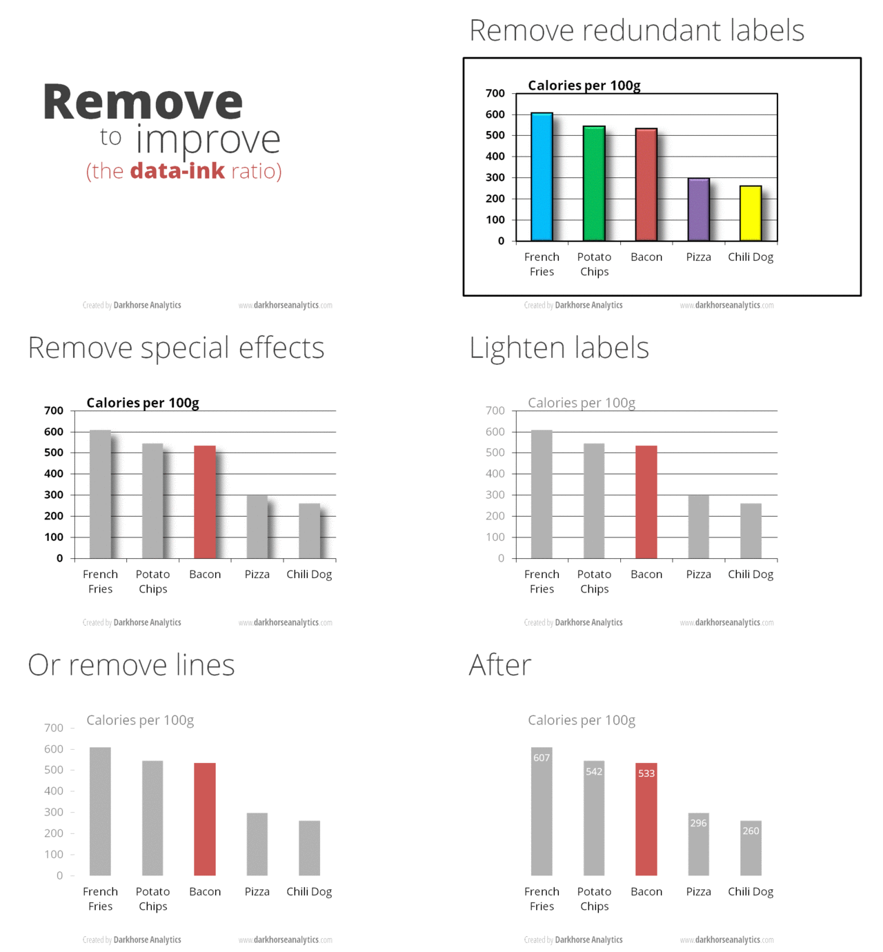
how to Create the Correct Chart

Following are some 'Best Practices' that you should use while creating the best chart for visualizing the data:
  • When using time:
    • Set it on the horizontal axis
    • Time should run from left to right
    • Do not skip values (time periods), even if there are no values
  • Remove clutter (any excess information, lines, colors, and text that does not add value)
  • Sort your data in ascending or descending order by the value, not alphabetically (to enable easier comparison)
  • Don’t use a legend if you have only one data category
  • Use labels directly on the line, column, bar, pie, etc., whenever possible, to avoid indirect look-up
  • When using monetary values in a long-term series, adjust for inflation
  • When using colors:
    • Don’t use more than 6 colors
    • For comparing the same value at different time periods, use the same color in a different intensity - from light to dark
    • For different categories, use different colors - The most widely used colors are black, white, red, green, blue, and yellow
    • Keep the same color palette or style for all charts in the series, and same axes and labels for similar charts to make your charts consistent and easy to compare
    • Check how your charts would look when printed out in grayscale. If you cannot distinguish color differences, you should change hue and saturation of colors
    • 10% of men have color deficiency - Use some tool like Vischeck to test your Chart - Best is to use the color palettes that are friendly to color-blind people
  • Don’t add too much information to a single chart - If necessary, split data in two charts, use highlighting, simplify colors, or change chart type
See a BAD chart here:

DEMO of removing clutter from a chart:

One good resource to select the best chart is the below strategy created by Dr. Andrew Abela:


Sources:
Eazybi.com
Extremepresentation.typepad.com
Designingforanalytics.com
Quora.com

Best Online Communities & Groups for UX & Product & Business discussions - Facebook groups

Mixergy Premium
https://www.facebook.com/groups/1748351532109686/
Hackathon Hackers
https://www.facebook.com/groups/hackathonhackers/

Bots
https://www.facebook.com/groups/chatbot/

The Startup Chat Mastermind Group
https://www.facebook.com/groups/TheStartupChat/

The Product Group
https://www.facebook.com/groups/theproductgroup/

HH Product Management
https://www.facebook.com/groups/hhProductManagement/

The 7 Day Startup
https://www.facebook.com/groups/592264044218722/

London Statups
https://www.facebook.com/groups/LDNstartups/

Product Management - Designing Mobile phone for the Hearing-impaired & for Visually-impaired

How would you design a mobile phone for the hearing-impaired?
Mobile-phone for the hearing-impaired (or deaf) would be simply a Text-phone.

Messaging & Chat-apps will be the most important features of this phone.

How would you design a mobile phone for the visually-impaired?
Mobile-phone for the visually-impaired (or blind) would simply be a phone having a voice-over function where everything will be voice driven.

Such phone can also have hand-gestures-commands and touch-commands to further improve it.

Product Management - Designing the HomePage of eCommerce website

What should the 'Home Page' of an ECommerce website ideally look like 
and what elements should it always definitely have?

To answer the above question, we will break it into smaller questions; and try to answer the same; and eventually answer the it:


Question - Why you need the home page?

Answer - Users will use this page to understand what your site is all about.

Question - What is the site about?

Answer - eCommerce.

Question - What are the main informational-components of eCommerce?

Answer - Categories, sub-categories, products, offers/promotions, Brands, collections of products.

Question - Returning users will use this page to look out for new content or for content they already visited. What will; in this above list; entice the new users ?

Answer - New products we want to showcase, hot selling hot-selling, new categories/sub-categories/brands recently launched, recently viewed products.

Question - what is the priority of the information (informational-components) that we want to showcase of homepage?

Answer - this is something that will vary from business to business depending on their goals  or vision & mission, the kind of new-vs-returning traffic they get, the revenue-targets they are supposed to achieve via the site. For now, lets assume that we have the following priority order:

Categories > Sub-categories > Offers/promotions > Brands > Products > Collections of products

So, the 'Home Page' of an ECommerce website will have sections; arranged from top to bottom; that will showcase the above-prioritized information.

Anonymity Experience (feature) of Quora

Quora, today, posted on its
'QUORA PRODUCT UPDATES' blog that they are 
Launching a new
Anonymity Experience

Here is the summary of the same:

At Quora, we started to rethink the anonymity experience for a few reasons. 

Over the years, many people have expressed how impactful anonymity has been to their Quora experience. By far, the most common themes were that people valued anonymity when there were personal or sensitive experiences involved, or they were seeking or sharing knowledge in controversial topics. 

But, anonymity on Quora is not without its faults. We have also seen the potential for anonymity to be a vector for spam and abuse.

When designing the new anonymity experience, it was important for us to address moderation and abuse issues while preserving the ability to share knowledge anonymously.

Here are the list of changes:
All anonymous content will be reviewed for spam and harassment before receiving distribution. 

You'll still be able to report questions or answers for us to re-review if you feel that we make a mistake or if a different policy is violated.
Anonymity will only be for contributing questions or answers. 

The ability to anonymously upvote, comment, merge questions, suggest edits, send thanks, edit answer wikis, revert edit log operations, or send answer requests will no longer be supported. These features were always the most likely to be vectors for abuse. These actions will now always have a name associated with them. 

Anonymous question editing (including question text, details, and topics) will be reserved for the person who asked the question and all other edits to the question will be public.
Quora's internal systems will no longer connect user accounts with anonymous content they contribute. When we move to the new experience, we will begin removing existing connections in our internal systems. This means that editing or deleting your existing anonymous questions or answers will require an anonymous edit link.

Source:
https://productupdates.quora.com/Upcoming-Changes-to-Anonymity-on-Quora

Products that have bad User Experience (UX) for the Left-handed people

Unfortunately many of the products that we use on a daily basis are designed to be used only for the right-handed people. Lets look at some of them:

AH55177A
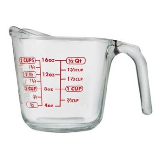
Measuring cups.

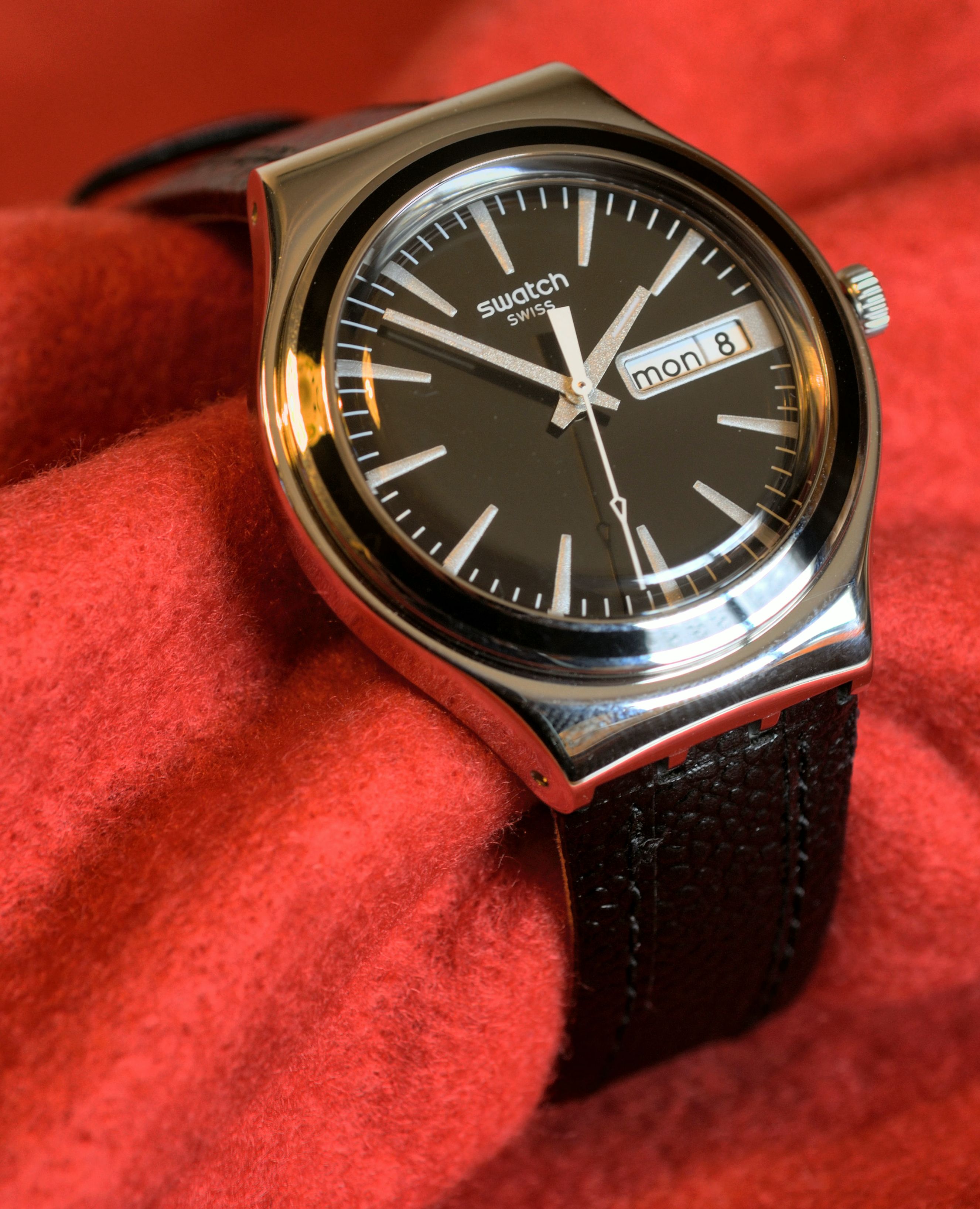
Watches' winding buttons; used to set the time; are on the wrong side. When worn on the left hand by right-handed people, it is easy to use the winding button. But if a left-handed person wears the same on his right-hand, he will have to take the watch off to wind it.

12875-stock-photo-jeans-things-pants-close-undo-zipper
In the pants/jeans/trousers, the flap over the zipper opens on the right side.

Handheld-Camera
The camcorders' shutter-buttons & controls are always on the right.

Same as above.

WRITINGleft-hand_notebook
Spiral-bound-notebooks - The spiral is on the right making it extremely difficult for the left-handed people to write. The only solution is shown above - Use spiral notebooks backwards (front cover becomes the back and vice versa).

Driver's cup holder is for the right hand.
The cup-holder is always on the right.

These desks.
These desks are specifically for the right-handed.


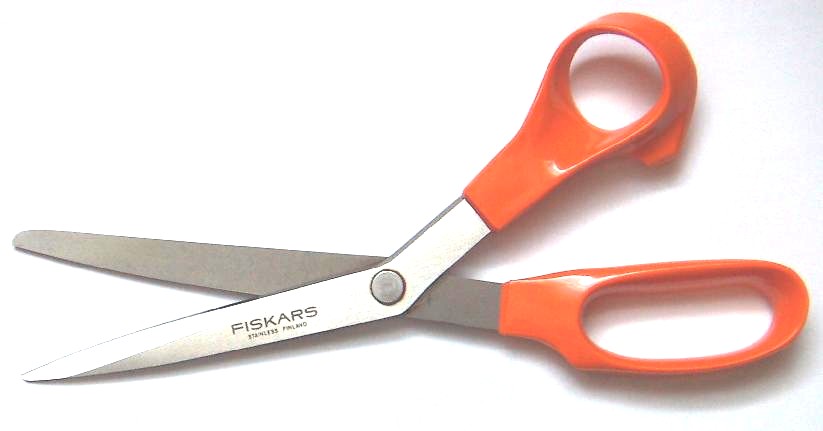
These scissors can't be used by the left-handed.


Source:
fishofgold.files.wordpress.com
upload.wikimedia.org
buzzfeed.com/katienotopoulos/the-18-worst-things-for-left-handed-people