Following are some 'Best Practices' that you should use while creating the best chart for visualizing the data:
One good resource to select the best chart is the below strategy created by Dr. Andrew Abela:
- When using time:
- Set it on the horizontal axis
- Time should run from left to right
- Do not skip values (time periods), even if there are no values
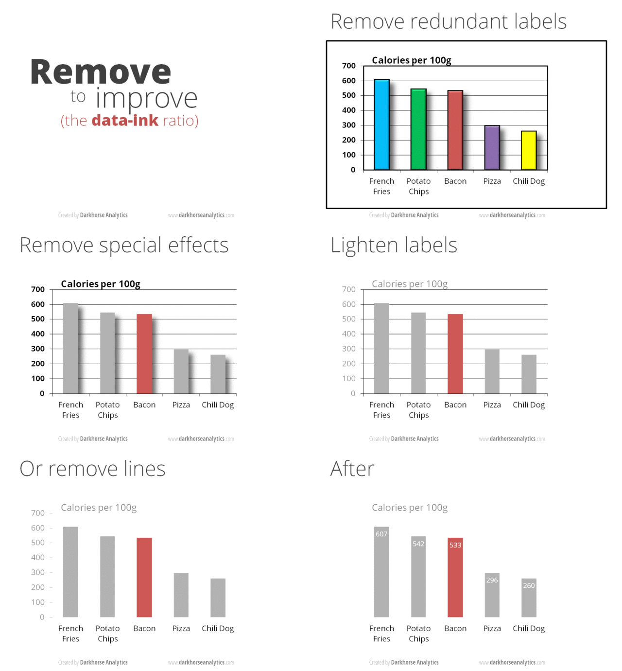
- Remove clutter (any excess information, lines, colors, and text that does not add value)
- Sort your data in ascending or descending order by the value, not alphabetically (to enable easier comparison)
- Don’t use a legend if you have only one data category
- Use labels directly on the line, column, bar, pie, etc., whenever possible, to avoid indirect look-up
- When using monetary values in a long-term series, adjust for inflation
- When using colors:
- Don’t use more than 6 colors
- For comparing the same value at different time periods, use the same color in a different intensity - from light to dark
- For different categories, use different colors - The most widely used colors are black, white, red, green, blue, and yellow
- Keep the same color palette or style for all charts in the series, and same axes and labels for similar charts to make your charts consistent and easy to compare
- Check how your charts would look when printed out in grayscale. If you cannot distinguish color differences, you should change hue and saturation of colors
- 10% of men have color deficiency - Use some tool like Vischeck to test your Chart - Best is to use the color palettes that are friendly to color-blind people
- Don’t add too much information to a single chart - If necessary, split data in two charts, use highlighting, simplify colors, or change chart type
See a BAD chart here:
DEMO of removing clutter from a chart:
Sources:
Eazybi.com
Extremepresentation.typepad.com
Designingforanalytics.com
Quora.com

No comments:
Post a Comment