What problems do Online Products (web-sites & mobile-apps like WhatsApp, Facebook, Wikipedia, Stack Exchange, Quora, Twitter, Linkedin, Pinterest) solve ?

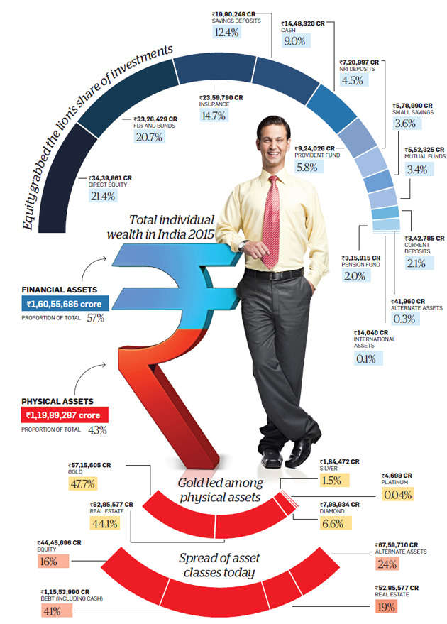
In this post we will try to understand how the most-used online-products of our times justify their existence. In short we will try to find out that which of our problems are being solved by these web/mobile products?

WhatsApp
SMSs are/were expensive - Whatsapp made it free (in a way). In developing countries most people had a personal cell phone number before they ever got an email. So the natural id of these people is/was their cell phone number. For these people, creating a user-id for a given website or remembering their email is/was really hard (because they din't speak English fluently) - WhatsApp made their cell-phone-numbers their ids.

Facebook
Amid the dying MySpace & Orkut, people wanted to remain connected with their loved ones (knowing what you're friends/families are up to). Facebook solved this.

Wikipedia
Wikipedia was created to become a open-source, publicly-editable, free, online encyclopedia. Wikipedia is the largest and most popular general reference work on the Internet today. Wikipedia gave us one single trust-able source of knowledge.

Stack Exchange/Overflow
Stack Exchange is a network of question-and-answer websites on topics in varied fields, each site covering a specific topic, where questions, answers, and users are subject to a reputation award process. The sites are modeled after Stack Overflow, a similar site specifically designed for computer programming questions that was the original site in this network. The reputation system allows the sites to be self-moderating. Not every problem's solution can be found on Google - you need to post it somewhere and let people answer it for you - SE/O solved this problem.

Quora
StackOverflow/Exchnage gives answers to practical & detailed questions about actual problems that the users have faced. It expects users to include details about what users had tried and exactly what you are/were they trying to do. So, not all questions work well in the mentioned format - for example, questions that are opinion-based, or that are likely to generate discussion rather than answers - are voted out or blocked. For such questions users needed something - Quora was the answer! The beauty of Quora is that even when you ask a question which has a definitive answer, users post the answer but also elaborate their thought-process and their perspectives around the same.

Twitter
It was conceived as a system where one could send a text-SMS to a number and it would be broadcasted out to all of his friends. Eventually, it became a service via which a person could broadcast his status (what he was doing at a given time) out to all of his friends. SMS-boradcasting was costly. Twitter solved it.

Linkedin
When LinkedIn started in 2002, it was a social network for professionals, where users could host their resumes online. The purpose for many was to seek out jobs and have their colleagues and mentors leave recommendations to bolster their credibility. But in the ten years since, it has slowly evolved into more of a contact relationship management service, but for individuals. Linkedin was launched after the dot-com-bubble had just burst, and the investors had little confidence in internet-entrepreneurs. Linkedin gave a trust-able face to the working professionals & entrepreneurs.

Pinterest
Ease of discovering, organizing, collecting, and sharing web content in a visual and social manner, most of which appeals to a large demographic of females.

major Acquisitions of Internet / Online / Technology companies in the corporate world till-date

Linkedin
Jun 2016 - acquired by Microsoft for $26B
Linkedin is a business/employment oriented social networking service. As of 2016, it had more than 467M users in over 200 countries and territories.

Skype
Sep 2005 - acquired by eBay $2.6B
May 2011 - acquired by Microsoft for $8.5B
Skype is an application that provides video chat and voice call services. Users may exchange such digital documents as images, text, video and any others, and may transmit both text and video messages. Skype allows the creation of video conference calls. Skype is based on a freemium model. Much of the service is free, but Skype Credit or a subscription is required to call a landline or a mobile phone number. At the end of 2010, there were over 660M users, and 300M MAU (monthly active users) in 2016.

Yammer
Jun 2012 - acquired by Microsoft for $1.2B
Yammer is a freemium enterprise social networking service used for private communication within organizations. Access to a Yammer network is determined by a user's Internet domain so that only individuals with approved email addresses may join their respective networks. Just before acquisition it had reached 8M user-base.

WhatsApp
Feb 2014 - acquired by Facebook for $19B
WhatsApp Messenger is a free, cross-platform, end-to-end encrypted instant messaging, proprietary and social media application for smartphones. It uses the Internet to make voice calls, one to one video calls; send text messages, documents, PDF files, images, GIF, videos, user location, audio files, phone contacts and voice notes to other users using standard cellular mobile numbers. By Feb 2016, WhatsApp had a user base of over 1B making it the most popular messaging application at the time.

Instagram
Apr 2012 - acquired by Facebook for $1B
Instagram is a mobile photo-sharing application and service that allows users to share pictures and videos either publicly or privately on the service, as well as through a variety of other social networking platforms, such as Facebook, Twitter, Tumblr, and Flickr. Instagram was launched in Oct 2010 as a free mobile app, exclusively for the iOS mobile platform via the Apple App Store, but was later released for Android devices in Apr 2012. The service rapidly gained popularity, with over 100M MAU (monthly active users) as of Apr 2012 and over 300M MAU as of Dec 2014. It was acquired by Facebook in Apr 2012 for ~$1B. In 2013, Instagram grew by 23%, while Facebook, as the parent company, only grew by 3%.

Yahoo!
Jul 2016 - acquired by Verizon for $4.8B
In Jan 2000, at the height of the dot-com boom, Yahoo! was valued at $125B. During it's downfall, in Feb 2008 Microsoft made an bid to acquire Yahoo for $44.6B which Yahoo! declined.
Yahoo! valuation timeline

Motorola Mobility
Aug 2011 - acquired by Google (Alphabet) for $12.5B
This was the biggest acquisition by Google after DoubleClick (an online advertising platform acquired in Apr 2007 for $3B) & Youtube (an video sharing paltform acquired in Oct 2006 for $1.6B)
Oct 2014 - acquired by Lenovo for $2.9B
Motorola Inc. was an American multinational telecommunications company. After having lost $4.3 billion from 2007 to 2009, the company was divided into two independent public companies, Motorola Mobility and Motorola Solutions on January 4, 2011. Motorola Solutions is generally considered to be the direct successor to Motorola, Inc., as the reorganization was structured with Motorola Mobility being spun off. Unlike most other acquisitions, this was about Google acquiring patents (which the search giant retained after the sale to Lenovo) to defend itself against Apple rather than have an integrated hardware maker.


Source:
computerdealernews.com/slideshows/updated-top-10-biggest-tech-acquisitions-of-all-time
visualcapitalist.com
en.wikipedia.org/wiki/List_of_mergers_and_acquisitions_by_Alphabet
en.wikipedia.org/wiki/List_of_mergers_and_acquisitions_by_Facebook
en.wikipedia.org/wiki/List_of_mergers_and_acquisitions_by_Microsoft

Products that have bad User Experience (UX) for the Left-handed people

Unfortunately many of the products that we use on a daily basis are designed to be used only for the right-handed people. Lets look at some of them:

AH55177A
Measuring cups.

Watches' winding buttons; used to set the time; are on the wrong side. When worn on the left hand by right-handed people, it is easy to use the winding button. But if a left-handed person wears the same on his right-hand, he will have to take the watch off to wind it.

12875-stock-photo-jeans-things-pants-close-undo-zipper
In the pants/jeans/trousers, the flap over the zipper opens on the right side.

Handheld-Camera
The camcorders' shutter-buttons & controls are always on the right.

Same as above.

WRITINGleft-hand_notebook
Spiral-bound-notebooks - The spiral is on the right making it extremely difficult for the left-handed people to write. The only solution is shown above - Use spiral notebooks backwards (front cover becomes the back and vice versa).

Driver's cup holder is for the right hand.
The cup-holder is always on the right.

These desks.
These desks are specifically for the right-handed.


These scissors can't be used by the left-handed.


Source:
fishofgold.files.wordpress.com
upload.wikimedia.org
buzzfeed.com/katienotopoulos/the-18-worst-things-for-left-handed-people

how did Pinterest get its initial Traction ?


Pinterest, the content-sharing site that allows users to pin (share) images and videos to their digital pinboard, is currently one of the most popular social media websites on the Internet. In 2016, Pinterest had 110M monthly users & over 50 Billion pins. The question that we are trying to answer in this post is that how did Pinterest get its initial set of growth/users? After reading around the web, I was able to figure this out:

1.
Pinterest’s initial users hailed from the home town of Pinterest's founder. They started using the site after coming to know of it from the founder’s family.

2.
3 months after launch, Pinterest found itself stuck at 3k users. To boos Pinterest’s population, the founder decided to find others like himself – “power users” who would use Pinterest as often and love it as much as he did. For this, the company organized meetups at local boutiques, handed out Pinterest invites, and turned the participants into the forerunners of their word-of-mouth effortsPinterest’s initial userbase comprised mainly of people involved in handicrafts. These are social hobbies, known for having active communities. A single member of a neighborhood sewing club at a Pinterest event could potentially spark an entire suburb into using Pinterest. Pinterest found the right audience who just so happened to already have tightly-knit communities in place forward to spread.

3.
A woman named Victoria helped the founders organize a program called pin-it-forward, which was like a chain letter where users circulated different pinboards about what their homes meant to them. Pin-It-Forward was a campaign that utilized bloggers to publicize Pinterest. Bloggers each assembled boards based on a theme (- 'what home means to us') accompanied by a blog post. These blog posts were linked to posts from other bloggers, therefore pinning-it-forward. These bloggers also released invites to Pinterest. Readers were encouraged to make use of their Pinterest invites and remix the bloggers’ boards into boards of their own. At the moment, Pinterest has evolved into a major player for fans of DIY and handicraft content, with viewership rivaling the DIY bloggers that once ruled the segment. These same bloggers were the participants of Pin-It-Forward. Pin-It-Forward was essentially a transition of Pinterest’s grassroots word-of-mouth effort onto the internet, using community leaders to spread the word of Pinterest to their fans, followers, and contemporaries.

4.
Pin-It-Forward made a comeback in 2013, this time targeting potential Pinterest users in the UK by featuring a lineup of influential bloggers from all over the country. Pinterest also added a UK English option to the site so users would feel more at home. The 2013 version of Pin-It-Forward used a similar strategy, using local stars and community leaders to bring users to Pinterest.

5.
In order to join Pinterest, users couldn't just visit the website and join. Instead, they were supposed to request an invitation to the site, making it feel like an exclusive club to which you actually want to belong. People always want to be a part of something that they're not initially included in. The invitation email used strategic wording and content, as well, to help bolster its image, calling Pinterest a small community and offered rules about how to behave while there.

6.
Pinterest initially had an automatic link with Facebook. Once users joined the Pinterest, instantly they were given the option to sign up with their Facebook account, making it easy for users to start using the site without jumping through a million hoops and more likely that they'll start using the site right away as opposed to putting off use because of all the bureaucratic stuff. This also connects users to their Facebook friends immediately, so that they don't start with an empty social media profile page. Rather, Pinterest's Facebook connection allows new users to see a page full of people they know, which is an incentive to keep using and exploring further.

7.
When a user first starts using Pinterest he goes through an interest survey. Pinterest shows users a variety of images and asks which ones appeal to them. Based on a user's responses, it follows some related and popular boards that match the user's choices, automatically generating content and information that makes users feel like they are already part of a community and in turn, encourages them to explore the site further.


Source:
logoopenstock.com/user/634/pinterest
businessinsider.com/the-secret-to-pinterests-astounding-success-a-brilliant-sign-up-process-you-should-copy-2012-1
techcrunch.com/2011/11/26/pinterest-viral/
referralcandy.com/blog/pinterest-marketing-strategy/
growthdevil.com/pinterest-get-so-big/

Google Material Design - Components & Design Patterns (with their usage-guide)

Bottom Navigation Bar
Guide: These let users explore, & switch between 3-5 destinations that require direct access. For larger displays, this can be replaced by a Left Navigational Bar.
Alternates: Persistent Navigation Drawer, Tabs

Persistent Navigation Drawer
Guide: These slide in from the left and contain the navigation destinations for your app.

Permanent Navigation Drawer
Guide: Used in desktops, these permanently stay & contain the navigation destinations.

Modal Bottom Sheet (supports DeepLinking)
Guide: These slide up from the bottom of the screen to reveal more content.

Persistent Bottom Sheet
Guide: These integrate with the app to display supporting content.

Raised Buttons
In the above image - (Clear Data, Force Stop, Uninstall)
Guide: These may display text, imagery, or both.

Flat Buttons in a Alert Dialog
In the above image - (Agree & Disagree are the Flat Buttons)
Guide: Flat Buttons are text-only buttons, mostly used in Dialogs, Toolbars, or Inline.
Guide: Alert Dialogs are urgent interruptions that inform users about a situation and require their acknowledgement.

Dropdown Button
Guide: These let user make a selection.

Toggle Button (with multiple selections).
Guide: These buttons, group related options. Icon toggles allow a single choice to be selected or deselected.

Cards
Guide: These may contain a photo, text, and a link about a single subject.

Contact Chip 
In the above image - (having contact's name and image)
Guide: A chip represent a complex entity; such as a contact; in a small block. The chip may contain entities such as a photo, text, rules, an icon, or a contact. Selecting a chip opens a full detail view. Chips may be deleted if they display a delete icon.


Data Table having Check Box Selection Control
Guide: A data tables display sets of raw data. They are usually used in desktop enterprise products. Data tables may be embedded on a card, and  they can include: (1) a corresponding visualization (2) the ability to query and manipulate data. Data tables on cards may display navigation and data manipulation tools at the top and bottom.

Simple Menu Dialog

Simple Dialog

Picker (Time Picker) in a Confirmation Dialog
Guide: This dialog requires users to explicitly confirm a choice.

Full Screen Dialog
Guide: These are best suited to complex tasks, or require an input method editor, as they group a series of tasks together before they can be saved.

Full Bleed Divide in a List.
Guide: A divider is a thin, lightweight rule that groups content in lists and page layouts.
A full-bleed divider emphasizes separate content areas and sections that require more distinct visual separation. Alternatives to full-bleed dividers include white space, subheaders, or inset dividers.
Guide: Lists present multiple line items vertically as a single continuous element. Lists are made up of a continuous column of rows. Each row contains a tile. Primary actions fill the tile, and supplemental actions are represented by icons and text. Lists are best suited for similar data types.

Inset Divider
Guide: A divider is a thin, lightweight rule that groups content in lists and page layouts. Inset dividers are used to separate related content.

Expansion Panel
Guide: These contain creation flows and allow lightweight editing of an element. They may be used for a variety of tasks, such as (1) To edit a setting (2) To create a tool for ad campaigns

Grid List
Guide: These are an alternative to standard list views. A grid list consists of a repeated pattern of cells arrayed in a vertical and horizontal layout. Grid lists are best used on similar data types. They help improve the visual comprehension of the content they contain.

Menu
Guide: These display a list of choices on a transient sheet of material. Menus appear upon interaction with a button, action, or other control. They display a list of choices, with one choice per line. Menu items may be disabled if not applicable to a certain context. Contextual menus dynamically change their available menu items based on the current state of the app.

Snackbar aka Toast having a yellow Floating Action Button aka FAB 
In the above image - (Snackbar is notifying user that mail has been archived) 
In the above image - (FAB is the yellow button clicking which will let user create a new mail).
Guide: Snackbars provide brief feedback about an operation through a message at the bottom of the screen. Snackbars contain a single line of text directly related to the operation performed. They may contain a text action, but no icons. Toasts (Android only) are primarily used for system messaging. They also display at the bottom of the screen, but may not be swiped off-screen. Only one snackbar may be displayed at a time. Each snackbar may contain a single action, neither of which may be Dismiss or Cancel.
Guide: A FAB represents the primary action in an application. It is used for a promoted action & is always shaped like a circled icon floating above the UI. Only one floating action button is recommended per screen to represent the most common action.

Vertical Stepper
Guide: Steppers convey progress through numbered steps. They may also be used for navigation. They may display a transient feedback message after a step is saved.

Horizontal Linear Non-editable Stepper
Guide: Steppers convey progress through numbered steps. They may also be used for navigation. They may display a transient feedback message after a step is saved. Non-editable steps should be used when: (1) Users cannot edit a step later (2) Step editing poses a distraction risk to form completion

Horizontal Non-linear Editable Stepper
Guide: Editable steps allow users to return later to edit a step. These are ideal for workflows that involve editing steps within a session.

Horizontal Linear Non-Editable Optional Stepper

Fixed Tab (While the Scrollable Tabs display a subset of tabs at any given moment).
Guide: Tabs make it easy to explore and switch between different views. Tabs enable content organization at a high level, such as switching between views, data sets, or functional aspects of an app. Present tabs as a single row above their associated content. Tab labels should succinctly describe the content within. Because swipe gestures are used for navigating between tabs, don't pair tabs with content that also supports swiping.

Source:
https://material.io

Indian banknote Demonetisation by Prime Minister Mr. Narendra Modi

2016 just ended.
Welcome to 2017.

While the US citizens will remember 2016 for bringing Donald Trump to power, the Indian heads and hearts will never be able to forget the year 2016 because of the Indian banknote Demonetisation done my Indian Prime Minister Mr. Narendra Modi (aka NaMo).

Withdrawing High Denomination (500 & 1000) Currency Notes [aka demonetization] was also done before [1946, 1978 - by British India, Morarji Desai]. But the very fact that NaMo government was able to do this so secretly in such a connected manner speaks volumes. Indira Gandhi tried this in early 1970s, but could not as the move leaked out and the bad guys quickly changed over the notes. The government had to back out of the move then.

In this post, we will discuss why did Modi take the epic decision of demonetisation and what was/will-be the impact of the same on India.

Lets look at some numbers first:

1.
Total banknotes in circulation valued to $250B (17 Lakh Crore) of which ~90% ($200B or 15 Lakh Crore) was 500 & 1000 banknotes.

2.
India’s total tangible wealth is $5Trillion (300 Lakh Crores) of which 25% ($1.25Trillion or $1250B or 70 Lakh crores) is estimated by  the World bank to be Black. Lets assume that 10% of it is in cash ($125B or 7 Lakh crores), & the rest is in real-estate or gold. See the image below for details:

Click to enlarge

Targets of demonetisation were:
  • Bringing out black money stashed in economy. People have been asked to deposit old notes in their accounts - This will help gov track who has what - People who will declare crore(s) of black money, will pull the gov intelligence to come after them. If instead, people decide to destroy their black money, destruction of the currency notes will be very beneficial to the gov because RBI knows how many notes are in circulation - After the exchange time window would closes on 2016 year-end, RBI will tally the deposited notes with their records. The notes that did not reach RBI because they were destroyed will become a direct profit to the RBI and will be given to the govt as a dividend. The RBI will print new notes worth the same value.
  • Having a lid on the fake money racket supported by India's neighboring countries. See the image below to understand the dynamics of the same.
  • Making India to go cashless. The banks plan to not hand people wads of the new cash, but instead just credit the same to your bank. Also, the ATM machines plan to have stricter limits on withdrawals - which will drive the card usage.
  • Moving the notes to a more secure standard - with better protection against counterfeiting.
  • Reducing gold imports.
  • Curbing black money & fake money means curbing corruption, smuggling & terrorism.
  • This decision will help institutionalize the real estate sector; and curbing inflation in the same; by bringing more transparency in the Indian real estate industry - reason being that this sector runs mostly on black money. This step would give the Indian real estate sector more credibility making it more attractive to the foreign as well as domestic investors. As a result, the housing prices could witness downward pressure, helping revive demand in the sluggish housing segment. Summary is that the houses, flats, lands will come in reach of common man.
  • Similarly, it will also help the common man by putting an end to the artificial increase in Higher Education and Healthcare transactions bringing them within the reach of the common man.


Most importantly, all this was to be done in a way that it should have minimal impact on normal users of currency. For the middle-class-people, this would be a step in moving their transactions that happen on 500 & 1000 to netbanking, cheque, cards. Poor dont use netbanking, cheque, cards as most of their transaction happen under Rs. 500.

NaMo


Sources:
happynewyear2017dp.com
quora.com/What-do-you-think-of-the-decision-by-the-Indian-Government-to-demonetize-500-and-1000-rupee-notes
terrornewsindia.blogspot.com
quora.com/topic/India-Scraps-Two-Largest-Currency-Notes-November-2016
economictimes.indiatimes.com/wealth/invest/karvys-india-wealth-report-2015-equity-scores-over-gold/tomorrowmakersshow/50330485.cms