Bottom Navigation Bar
Guide: These let users explore, & switch between 3-5 destinations that require direct access. For larger displays, this can be replaced by a Left Navigational Bar.
Alternates: Persistent Navigation Drawer, Tabs
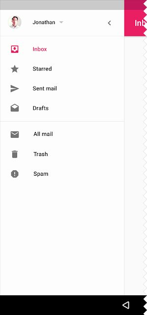
Persistent Navigation Drawer
Guide: These slide in from the left and contain the navigation destinations for your app.
Permanent Navigation Drawer
Guide: Used in desktops, these permanently stay & contain the navigation destinations.
Modal Bottom Sheet (supports DeepLinking)
Guide: These slide up from the bottom of the screen to reveal more content.
Persistent Bottom Sheet
Guide: These integrate with the app to display supporting content.
Raised Buttons
In the above image - (Clear Data, Force Stop, Uninstall)
Guide: These may display text, imagery, or both.
Flat Buttons in a Alert Dialog
In the above image - (Agree & Disagree are the Flat Buttons)
Guide: Flat Buttons are text-only buttons, mostly used in Dialogs, Toolbars, or Inline.
Guide: Alert Dialogs are urgent interruptions that inform users about a situation and require their acknowledgement.
Dropdown Button
Guide: These let user make a selection.
Toggle Button (with multiple selections).
Guide: These buttons, group related options. Icon toggles allow a single choice to be selected or deselected.
Cards
Guide: These may contain a photo, text, and a link about a single subject.
Contact Chip
In the above image - (having contact's name and image)
Guide: A chip represent a complex entity; such as a contact; in a small block. The chip may contain entities such as a photo, text, rules, an icon, or a contact. Selecting a chip opens a full detail view. Chips may be deleted if they display a delete icon.
Data Table having Check Box Selection Control
Guide: A data tables display sets of raw data. They are usually used in desktop enterprise products. Data tables may be embedded on a card, and they can include: (1) a corresponding visualization (2) the ability to query and manipulate data. Data tables on cards may display navigation and data manipulation tools at the top and bottom.
Simple Menu Dialog
Simple Dialog
Picker (Time Picker) in a Confirmation Dialog
Guide: This dialog requires users to explicitly confirm a choice.
Full Screen Dialog
Guide: These are best suited to complex tasks, or require an input method editor, as they group a series of tasks together before they can be saved.
Full Bleed Divide in a List.
Guide: A divider is a thin, lightweight rule that groups content in lists and page layouts.
A full-bleed divider emphasizes separate content areas and sections that require more distinct visual separation. Alternatives to full-bleed dividers include white space, subheaders, or inset dividers.
Guide: Lists present multiple line items vertically as a single continuous element. Lists are made up of a continuous column of rows. Each row contains a tile. Primary actions fill the tile, and supplemental actions are represented by icons and text. Lists are best suited for similar data types.
Inset Divider
Guide: A divider is a thin, lightweight rule that groups content in lists and page layouts. Inset dividers are used to separate related content.
Expansion Panel
Guide: These contain creation flows and allow lightweight editing of an element. They may be used for a variety of tasks, such as (1) To edit a setting (2) To create a tool for ad campaigns
Grid List
Guide: These are an alternative to standard list views. A grid list consists of a repeated pattern of cells arrayed in a vertical and horizontal layout. Grid lists are best used on similar data types. They help improve the visual comprehension of the content they contain.
Menu
Guide: These display a list of choices on a transient sheet of material. Menus appear upon interaction with a button, action, or other control. They display a list of choices, with one choice per line. Menu items may be disabled if not applicable to a certain context. Contextual menus dynamically change their available menu items based on the current state of the app.
Snackbar aka Toast having a yellow Floating Action Button aka FAB
In the above image - (Snackbar is notifying user that mail has been archived)
In the above image - (FAB is the yellow button clicking which will let user create a new mail).
Guide: Snackbars provide brief feedback about an operation through a message at the bottom of the screen. Snackbars contain a single line of text directly related to the operation performed. They may contain a text action, but no icons. Toasts (Android only) are primarily used for system messaging. They also display at the bottom of the screen, but may not be swiped off-screen. Only one snackbar may be displayed at a time. Each snackbar may contain a single action, neither of which may be Dismiss or Cancel.
Guide: A FAB represents the primary action in an application. It is used for a promoted action & is always shaped like a circled icon floating above the UI. Only one floating action button is recommended per screen to represent the most common action.
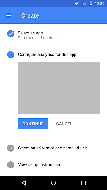
Vertical Stepper
Guide: Steppers convey progress through numbered steps. They may also be used for navigation. They may display a transient feedback message after a step is saved.
Horizontal Linear Non-editable Stepper
Guide: Steppers convey progress through numbered steps. They may also be used for navigation. They may display a transient feedback message after a step is saved. Non-editable steps should be used when: (1) Users cannot edit a step later (2) Step editing poses a distraction risk to form completion
Horizontal Non-linear Editable Stepper
Guide: Editable steps allow users to return later to edit a step. These are ideal for workflows that involve editing steps within a session.
Horizontal Linear Non-Editable Optional Stepper
Fixed Tab (While the Scrollable Tabs display a subset of tabs at any given moment).
Guide: Tabs make it easy to explore and switch between different views. Tabs enable content organization at a high level, such as switching between views, data sets, or functional aspects of an app. Present tabs as a single row above their associated content. Tab labels should succinctly describe the content within. Because swipe gestures are used for navigating between tabs, don't pair tabs with content that also supports swiping.
Source:
https://material.io


No comments:
Post a Comment